Statement

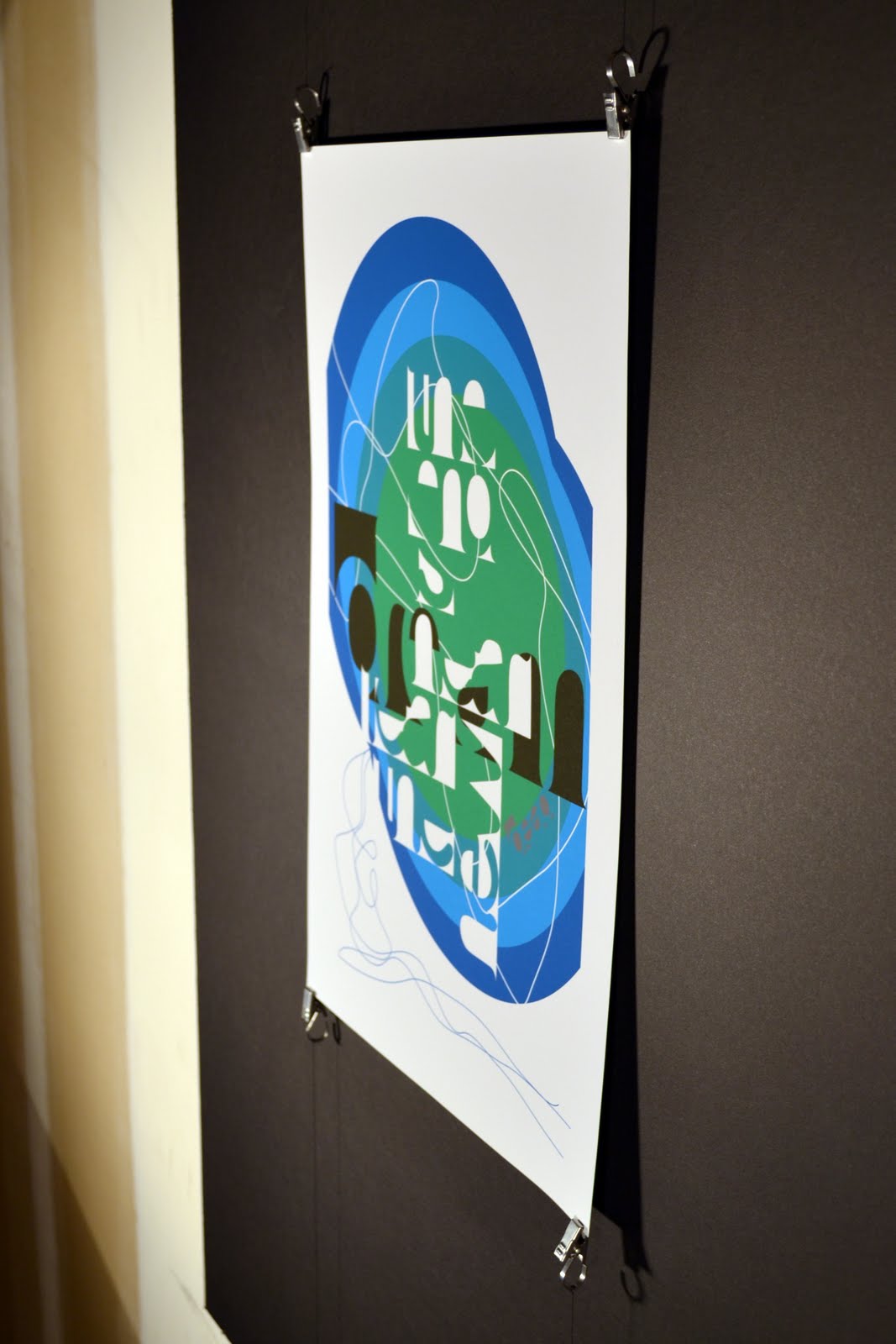
If I had to describe my own work, I would describe it as the combination of communication and expression. I take things that interest me in my life: family, friends, music, art; I use graphic design to reinterpret and publish them, allowing others to see what I see. I see graphic design as a process that involves determining the needs of a message and configuring them in a way that engages the desired audience. I am studying in the Visual Communication department at Weber State University so I can better understand how to adapt the figuration of form so my designs may communicate better than language.

I have always felt connected to visual communication. My earliest memory of communicating visually was when I was a young child in kindergarten. I would spend hours at the drawing table composing images of airplanes and aliens, my main interests at the time. I would take this passion home with me building huge and elaborate ships and towers out of Legos with my siblings. I was always enrolled in art classes in school, even as my family moved around the world. In high school I became involved in the production of the yearbook. I had a knack for image editing software and began producing as much as I could. I decided at this point that if I could make a living doing what I love, I had found my calling.

I have received much grief from my friends about being an “art student” during my time in college. I have continually ignored their misguided harassment because I know they do not comprehend the pivotal importance of graphic designers to society. A designer I admire, Neville Brody, once said, “…graphic designers hold high levels of responsibility in society. We take invisible ideas and make them tangible.” When I create something that communicates exactly what I intended, I feel accomplished to have solved the translation of the intangible message to a tangible visual communication object; something those who gave me grief could not do.

In the coming semesters studying in the Visual Communications department at Weber State University, I will refine my unique design process. I plan to better understand the power of configuration to create new meaning and I will obtain the necessary skills to become an effective and professional visual communicator.

List of Works

1
Title: The End Is Near
Medium: Digital Print
Size: 13" x 19"
Date: 2010
Description: This poster, inspired by Neville Brody and the impact of humans on the environment, was done as an assignment to explore the strengths and weaknesses of successful grid structures.

3
Title: Oh Em Gee
Medium: Digital Print
Size: 13" x 19"
Date: 2010
Description: Inspired by David Carson, this poster employs the use of a broken grid structure to effectively communicate a slightly humorous idea for an teen gossip magazine cover.

5
Title: Real OG
Medium: Woodcut, Digital Print, and Gouache
Size: 15" x 22"
Date: 2011
Description: Assigned as a project in Intermediate Printmaking to "refresh" ourselves back to the many printmaking processes, this piece is an abstract representation of a lyric in a song that speaks of O.G.'s (original gangsters) and how this label seems to drip from their personality.

7
Title: Haters gonna Hate
Medium: Screen Print and Letterpress
Size: 10" x 13"
Date: 2011
Description: This piece, created in Intermediate Printmaking, was inspired by a close friend who is a citizen of Syria. He is often held on the negative end of a false stereotype about people from Arab countries. I felt the need to point out just how ridiculous this stereotype is.
2
Title: Eat Snow
Medium: Digital Print
Size: 13" x 19"
Date: 2010
Description: Designed as part of a series of posters in Experimental Typography, this poster was inspired by Josef Muller Brochman's "Der Film" poster and my passion for snowboarding.

4
Title: No Hot Beverages
Medium: Silk Screen
Size: 15" x 22"
Date: 2010
Description: As part of an assignment to explore "culture", I observed the unspoken culture of Utah. The idea of culture being hidden and suppressed reminded me of soviet era propaganda, which I then compared to Mormon history to complete this piece.

6
Title: Type Configurations
Medium: Digital Print
Size: 17" x 17"
Date: 2010
Description: These pieces were completed as a class project that explored the use of various configured typographic forms. It was a way of learning the importance of configuration to create new meaning, which has helped me throughout all the other classes I have taken thus far.

8
Title: Hells Yeah
Medium: Letterpress
Size: 11" x 10"
Date: 2010
Description: Originally as part of a type configuration assignment in Experimental Typography, this officially was created using letterpress. The letter forms seemed to fall into place as this was being configured which created new and interesting shapes.

1 Aaron Fisher BFA: The End Is Near


Title: The End Is Near
Medium: Digital Print
Size: 13" x 19"
Date: 2010
Description: This poster, inspired by Neville Brody and the impact of humans on the environment, was done as an assignment to explore the strengths and weaknesses of successful grid structures.

2 Aaron Fisher BFA: Eat Snow


Title: Eat Snow
Medium: Digital Print
Size: 13" x 19"
Date: 2010
Description: Designed as part of a series of posters in Experimental Typography, this poster was inspired by Josef Muller Brochman's "Der Film" poster and my passion for snowboarding.

3 Aaron Fisher BFA: Oh Em Gee


Title: Oh Em Gee
Medium: Digital Print
Size: 13" x 19"
Date: 2010
Description: Inspired by David Carson, this poster employs the use of a broken grid structure to effectively communicate a slightly humorous idea for an teen gossip magazine cover.

4 Aaron Fisher BFA: No Hot Beverages


Title: No Hot Beverages
Medium: Silk Screen
Size: 15" x 22"
Date: 2010
Description: As part of an assignment to explore "culture", I observed the unspoken culture of Utah. The idea of culture being hidden and suppressed reminded me of soviet era propaganda, which I then compared to Mormon history to complete this piece.

5 Aaron Fisher BFA: Real OG


Title: Real OG
Medium: Woodcut, Digital Print, and Gouache
Size: 15" x 22"
Date: 2011
Description:  Assigned as a project in Intermediate Printmaking to "refresh" ourselves back to the many printmaking processes, this piece is an abstract representation of a lyric in a song that speaks of O.G.'s (original gangsters) and how this label seems to drip from their personality.

6 Aaron Fisher BFA: Type Configurations


Title: Type Configurations
Medium: Digital Print
Size: 17" x 17"
Date: 2010
Description: These pieces were completed as a class project that explored the use of various configured typographic forms. It was a way of learning the importance of configuration to create new meaning, which has helped me throughout all the other classes I have taken thus far.

7 Aaron Fisher BFA: Haters gonna Hate


Title: Haters gonna Hate
Medium: Screen Print and Letterpress
Size: 10" x 13"
Date: 2011
Description: This piece, created in Intermediate Printmaking, was inspired by a close friend who is a citizen of Syria. He is often held on the negative end of a false stereotype about people from Arab countries. I felt the need to point out just how ridiculous this stereotype is.

8 Aaron Fisher BFA: Hells Yeah


Title: Hells Yeah
Medium: Letterpress
Size: 11" x 10"
Date: 2010
Description: Originally as part of a type configuration assignment in Experimental Typography, this officially was created using letterpress. The letter forms seemed to fall into place as this was being configured which created new and interesting shapes.